Wednesday, December 2, 2009

On the threshold and old Florence art


I feel like I'm on the threshold of something good. which is good - because I feel like I've been kind of in stasis for the past couple of months. I think December will bring good things, I've been stressing a lot lately about a great many things but this past week went from really, really low to a medium high in a relative short amount of time. Sometimes I think that things must happen for a reason, so I have a good feeling now about the future. I feel like now would be the time for a fresh start, I feel optimistic for a change, still not totally there yet in what I want to accomplish but at I'm on the right track.

I've been feeling the art itch again, but it's hard because I really have nowhere to work. I miss my studio in the Bank building sooo much! I made a handmade sketchbook for a present for one of my friends, so I think I'll make a few more if I can find a place that sells book-board and find a recipe for wheat paste. books don't really take all that much space to make, it's the painting and mixed media stuff that feels like a daunting task at the moment. And I would like to be sketching or drawing but I feel so uninspired at home to start on something. Ugh.

So for lack of any new work to post I'll post some of my stuff from my semester abroad in Florence. This was the Spring semester of 2008.

The first image is a painting I did in Piazza della Signoria of Cellini's Perseus in the Loggia dei Lanzi. I sat there for a couple of hours in the cold and dark with my paints, being harassed by Italian men but I think it was pretty worth it.

The second painting was done from the view up at Piazzale Michelangelo on the other side of the Arno. This was done in a few hours as well from about 1pm to about sunset at maybe 7. This was a whole other experience since Piazzale Michelangelo was pretty crowded on that lovely afternoon with tons of performers and tourists. I remember there was this awful music from this Native American troupe, it was like listening to Yani ALL DAY. That coupled with the Japanese tourists the would want pictures with me was pretty frustrating and hard to concentrate. Any way, this painting is unique in that I first primed the canvas with gold spray paint and then went on top of that with oils.

This mask was handmade by me, using what I believe to be the traditional Italian mask-making process. There was a lovely mask store that I always would pass and one day I stopped in and started talking to the owner. He invited me to come to one of the workshops that he taught but unfortunately a lot of were after I would have had to leave, so he invited me to come anytime I wanted and he would show me one on one how the process was done. It's kind of a paper mache process with molds and glue. It was a lot of fun and a total cultural Italian moment for me. In return I gave him one of my etching I did depicting the opera Madame Butterfly and he gave me one of his prints. I painted the masks in oil and gold and black spray paint, not the traditional water based paints because I wanted a full range of color.

While I was in Florence, I took printmaking. I had not had the chance to take it at MICA and I had taken some classes in high school and again at the Art Students League, but I can't get enough of it, so I found myself in a position to take it abroad. In this piece I was trying to depict my love for both New York and Florence. They are such different cities but I wanted to show how much both inspire me artistically.

This etching was kind of an experiment. I was trying out the photo transfer process on a spare plate and I liked the graphic and textural quality of the overlapping images. I played around with layering, removing and adding parts of images, using cheese cloth to texture the resin and dripping the resin to get different effects. I then went on top of the finished print and used a reddish, greenish ink and watercolor.

I hope everyone had a great Thanksgiving, cheers!


Tuesday, October 27, 2009

Halloween Sketches


So I've been feeling particularly Halloween-y as of late. I've been watching a lot of the old monster and horror movies while working at the video store and I've also started reading H.G. Wells' The Invisible Man. I've decided to dress up this year as a Drive-in roller waitress from American Graffiti, mostly as an excuse to wear those rockin' skates that Jonathan Trundle gave me. I was going to be Cesare, the somnambulist that strangles people from The Cabinet of Dr. Caligari, but I thought it might be a bit obscure.

Anyway, here are some recent sketchbook drawings, all done in pencil. And of course my pumpkin paintings, done in acryllic, Vincent Price and Frankenstein's monster. Creepy bugs, monsters and bodies are basically what's been on my mind the past couple of weeks. Happy Halloween!!

Thursday, October 8, 2009

Lumenhouse/Studio job

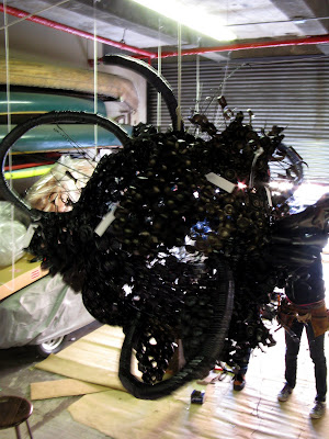
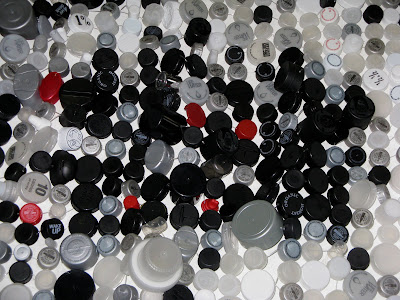
For those of you whose ears I have't talked off about this, I've been working at an art studio a couple of days a week. The artist I work for is Aurora Robson (her website is in the "people I like" list) and she mainly does large scale sculptures and installations made entirely of re-used plactic bottles, it's our job as her crewbies to help clean, cut rivet, melt or paint the various parts of these bottles together. We try to use every single part of these bottles- the screw top, the cap, the tube, the base and even scraps of plastic get used in a variety of ways to make many differnt forms. The plastic becomes entirely transformed and "trash" is the last thing you think of when you look at the final product.

So today at the studio we helped Aurora get the sculptures ready to be packed to be taken to the gallery at Salve Regina University in Rhode Island. For the past couple of weeks we've been preparing her show entitled "Landmines," I brought my camera so I could document part of the packing process. It was a really exciting and hectic day but it was a lot of fun. We wrapped and packed everything in a UHaul truck and it just barely fit. I can't wait to see pictures of how it looks set up in the gallery with the right lighting and the sculptures installed and lit up.

so here are some images

The Orb named "Fat Skeeter" who is maybe about 6 feet wide

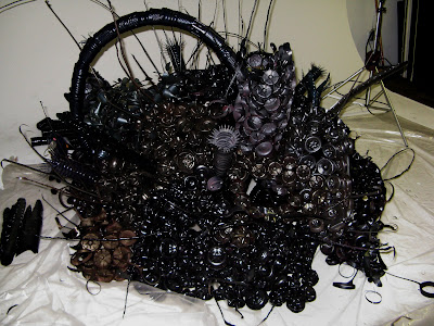
One of the two "Landmines" which are floor peices

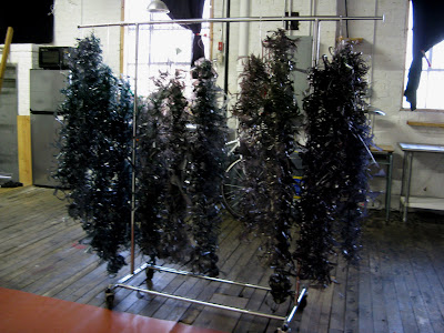
"Scrapple Strands" which will be layed on top of the landmines and the orb as a decorative and textural element.

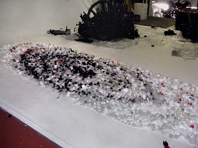
The infamous "Cap Blanket" which is made entirely of white, black, gray, silver, clear and red bottle caps, strung together both horizontally and vertically. Its supposed to look like a vortex-y outer space nebula thing, it looks really cool in person.

The "Cap Blanket" close up
Oh, and P.S.
Aurora has a 6 page article in October's issue of "Art in America" so check it out! she talks about her work and her process as well as this new show that'll be in RI. I keep checking Barnes & Noble but it's not in yet, it'll most likely be out tomorrow or monday. So, yeah cool beans!

Monday, September 21, 2009

The Preservation


Hellooo, sorry about the long lapse between posts but this time I actually have been fairly busy. Recently I've been working at the video store around the corner, doing this freelance animation thing which I'm super glad is over because I've never done animation before and I felt incredibly out of my depth, and I started working for Aurora Robson again (the artist I interned for last summer.) So yeah, I've been a busy bee.

This post will be highlighting my final for my book class, it's titled "The Preservation" and I really tried to combine elements from the Family Series of my Thesis with what I learned in book class. It's a Coptic bound book and I used a variety of methods and materials to get it to look and feel right. In this book I was really interested in texture both physically and aesthetically, some of the pages have collaged or layered elements to them next to flat printed images. I wasn't as concerned with the placement of images on the page, I wanted it to seem somewhat random.

The printed images often look 3D, as I xeroxed leaves, flowers, photographs and other objects directly onto the page. I also played a lot with my printer, printing on top of already printed things, feeding different types of paper and making photograms with the xerox machine in it, sometimes altering the size and scale of what I was xeroxing. Another element that tied it very strongly to my Thesis is that I actually took digital photographs of quite a few of my little Family collages, these photographs were often purposely blurry, and extremely close up, to only see part of the collage, I used these images as pages in the book.

The book deals with memory, family and personal history. It also simultaneously explores the history of photography and image making. One part I particularly like is that I took and old family photo, scanned it, played around in photoshop and inverted the black and white, I then printed it out on regular computer paper and oiled it to make it transparent. I took that "negative" and made a Cyanotype with it. I then took a digital picture of that Cyanotype and printed it out on a piece of paper to use as a page in this book. It's the process that I'm very interested in, of course I want the end product to look interesting but in the process I've used one of the oldest forms of image making in conjunction with some of the newest forms of image making. I also find it interesting that Bookmaking itself, along with Printmaking, have such a rich and old history, that many do not even think about day to day.

I do realize that in using actual flowers and putting the oiled images in the book, it will eventually look, smell and feel different over time, things will get browned and washed out but in I actually really like it. It's called The Preservation because I feel like I'm preserving the past, preserving history and like photography itself preserving moments in time. I had a ton of fun assembling this book and I feel that it is really what I was trying to get at with my Thesis, a sort of conclusion that sums everything up succinctly
.

Saturday, August 8, 2009

Capturing My Sole


I'm sorry I haven't updated in like forever. And the sad thing is, I can't even say I've been really busy with real life. I really haven't been doing much this past month to be honest, I can say I've been extremely lazy and remiss in my blogging duties. And for this I apologize and I will try to update more frequently.

Ok, so this book, titled Capturing My Sole, was my midterm project. I thought it would be cheeky to take pictures of all the shoes/footwear that I own (or rather, that I had in my possession with me at school) and make an album book of them. I took all the pictures myself and I decided that I wanted to show both the instep and the outside of the foot, so when the viewer turns the page you see the other side of the foot. I did pay attention to which images I thought would look good next to others. I even made it fit (sorta) in a shoe box I had, with the tissue paper and everything. I put the colophon on the inside of the lid of the box and I bound the book with a shoelace in a bow from my red Doc Martins. I really like the fact the the cover looks really elegant and somewhat serious, with the font and that title but the first page when you open it is an image of my Batman socks. I just had fun with this project, despite the fact that it was extremely expensive to print and some of the pages got smudged, all in all I think it was one of my most successful books.

Friday, July 3, 2009

Literary Hodgepodge


This book was for the Coptic binding assignment. I think that this type of binding is my favorite, it is very neat and the stitches look great on the spine. I like choosing colors for my thread, I always think about which color would go best with the color palette of my book, for Literary Hodgepodge I chose a sort of gunmetal grey color to compliment the black and white of the cover, and as its a neutral, it wouldn't interfere too much with the multicolored pages.

I also had fun with my fonts. I know there are people who are font people, who can look at a random flyer or advertisement and say "oh, they used a rounded helvetica," I'm not one of them. The only thing I've really learned in art school about various fonts is that Comic Sans is the worst font ever. Personally I don't really have too much against it, besides it being a bit juvenile and overused. Anyway, for the various fonts in the books I used different downloaded fonts from free font websites. I think it works, I wanted unique fonts that didn't stand out too much. I also used my own handwriting and actual pages scanned from books.
The idea of the book was to make pages for some of my favorite books or types of literature, I only ended up with nine double spreads, (five one page sections) I printed these pages on my home printer on bristol paper. Which was very aggravating as I had to get the page orientation exactly right (because of the double-sided printing) but in the long run sooooo much cheaper than going to the print lab. I think the quality of the images is probably just as good.
I used many different methods in designing the pages, I scanned various pages in books and sketches I had already done as well as photographs I had taken. I also googled images from the internet of Winnie the Pooh and Boris Karloff etc. and designed quite a few entirely in photoshop, I would then print them out and in some cases I would collage on top with paint or pen, wintergreen oil transfers, images printed or drawn on tracing paper. The cover was also done entirely in photoshop, based off of an assignment in freshman year which I re-did and improved upon.

The sections are Spread 1: Edgar Allan Poe's The Raven, Spread 2: Pablo Neruda 1, Spread 3: Pablo Neruda 2, Spread 4: Lawrence Ferlinghetti's Coney Island of the Mind 1, Spread 5: Lawrence Ferlinghetti's Coney Island of the Mind 2, Spread 6: William Carlos Williams' The Great Figure 5, Spread 7: J.R.R. Tolkien's The Hobbit, Spread 8: Various children's books, Spread 9: Mary Shelley's Frankenstein.

The last page is a single page dedicated to Where the Wild Things Are and The Little Prince.

As for the images in conjunction with the text, I tried to choose images that really represented what the text was about, like for the Coney Island of the Mind spreads, I chose images from Coney Island that I took during the summer that I felt really went well with the content of the poems. I chose the poems simple because they were my favorite Ferlinghetti poems and I believe it was just pure luck that I had images that I really liked that went perfectly with them. I draw a lot of things in my sketchbooks in response to works I've read, like the Neruda pages, I find his poems so visually stimulating that I want to depict them. And in the cases of The Raven and The Great Figure 5, I wanted to copy works by masters responding to the same text (Manet and Demuth. And as for the children's books and The Hobbit, I used images found in the books themselves, the original illustrations that we all know. I just had fun trying out different processes and exploring my own connection to the literary works that I love. I think all in all it is one of my most successful books that I've made, there would have been a few things I would change if I could (like adding a nicer table of contents, a title page and a colophon) but I am very proud of this particular book.

Monday, June 29, 2009

Blank books & Stuff to Buy book


Here are some more books I made. In class we always made a demo book step by step so that we knew what to do for homework on our own. These books were usually blank, so Laurie would call them “gifts” as opposed to “art” or “artists’ books” because there was no content. These books I will use as sketchbooks or notebooks.

The above pictures are of the demo books from the following assignments: Album binding (green), Coptic binding (purple with multicolored paper) and Case binding (Italian paper and blue book cloth). The long purple one is Stab bound with brown butcher’s paper, the sketches are from when I went to Dr. Sketchy’s a live model drawing session at a bar in Baltimore. For some we painted our own paper for the covers.

One assignment I found fun was the Stab binding project. This type of binding is a traditional Japanese binding and is typically made with very long, thin Japanese paper in the inside for flexibility. The paper is cut very long and then folded over and bound on the open side. I thought about the idea of the long, thin paper and what kind of project would lend itself to this type of binding. Finally I decided that I could bind all of my old shopping receipts in a book which I aptly titled “Stuff to Buy” the front and back cover is simply the back of various cardboard food products that were in the apartment. I wrote out my usual shopping list in red colored pencil and bound it with red thread. I wanted to keep the color palette black, white, brown and red. I find it kind of diaristic and somewhat autobiographical in that you can probably tell a lot about my personality through the products I buy (mostly food and art supplies) If you took the time to read you would notice patterns, like the fact that I eat a ton of Mac n’ cheese along with various blueberry products. I don’t eat meat, I prefer to buy more expensive fresh mozzarella and I spend a lot more money on art supplies than clothing. Along with the fact that I’m a pack rat and I have actually saved all of these receipts in the first place!

So I'll be a busy bee this week, which is really good because I spent the last two weeks basically in my room because it was rainy and I was super lazy. My brother just graduated H.S. (congrats Alex!!) and we're planning a duel graduation celebration/family get-together. Also one of my favorite gals, Jasmine, is in from California and there's going to be an amazing Glam Rock themed welcome back party in her honor. I'm throwing a dinner party for some of my guy friends where there will be lots of win, Scene It and Star Wars Trivial Pursuit. And then, hopefully I'll be working on some freelance stuff and working for Aurora again, which is super-awesome (and lucrative!)

That's all for now, I've taken more images, which will be up soon, so hold tight for more book art stuff!

Monday, June 22, 2009

Pamphlet Books!


So I finally got around to documenting my work from Laurie Snyder’s Photographic Book class. I’m going to do posts for each book so I can show multiple views and talk about each one individually unless they are related, in which case I’ll group them. These images of the books are not scans -- so they’re not perfect and there’s a lot of glare in some.

So these books were from one of our earlier assignments. It’s just a simple pamphlet fold, the first kind of book we learned to make, and they have 16 pages including the front and back covers. On our first day we had to make a book about out feelings about Barack Obama’s inauguration, which was the same day. The Obama book is about 5 ½ x 4 ¼ inches and is a collage using newspaper images, pencil, ballpoint pen and marker.

For homework we had to make a book with the same binding, the subject of the book being up to us. I decided to make a book about the different meals I like and foods and drinks that I enjoy and I bound the book with dental floss. The book itself is about 5 ¼ x 4 inches printed on the laser printer in the print lab. It came out all right I took pictures and used older images that I had taken before of different yummy foods and made a book. I didn’t like how the color print came out, the color is way off and it looks kind of gross so I decided to do a line sketch version of it, which is kind of unfinished. I’m not sure I really like how either of them turned out that muchbut I like the photographs I did for the food book, it's really too bad the color and print quality isn't better… Never the less, they're making me hungry just looking at them!

Wednesday, June 17, 2009

The Labors of Hercules


These images are from my series “The Labors of Hercules” which was also a part of my Senior Thesis. This series basically took similar ideas from the “Family/preservation of Heritage series” (tradition, cultural values, etc.) and made them more focused on cultural identity as opposed to personal identity. The pieces depict the individual labors in a very simple way, the slaying of the creatures or the action of the labor is not shown directly but I wanted the observer to understand as much of the myth as possible without the paintings being overly explicit or literal. The order of the images is actually backwards because the Lion is supposed to be first and Cerberus is last.

Cerberus- Spray paint and acrylic on panel.
The Cretan Bull- Gesso and pencil on wood.
The Stymphalian Birds- Oil, tin foil and shellac on wood.
The Golden Hind- Spray paint, pencil, acrylic and shellac on wood.
The Nemean Lion- Oil and shellac on wood.

On a different note, I'm trying to figure out why my default language/type on this blog is Hindi...
व्त्फ़? = WTF?

Friday, June 5, 2009

Some Older Work (First of the Family Series)


These pieces were done during the Spring of my sophomore year at MICA. This idea of the Family / Preservation of Heritage Series was germinated in my Collage & Assemblage class for the assignment of "Ageing and Distressing" in which we had to take new materials and make them look old or worn.

Wednesday, June 3, 2009